Restyling a website used to mean a designer and a few days. Now AI can produce a first pass in minutes, as long as you describe the style precisely. Ask it to "make it glassmorphism" and you get a blur on everything; give it a spec with the colours, the type, the surfaces and what to avoid, and you get the actual style. Here are 22 styles, each with a reference image, a live demo and a prompt you can paste straight in.
How to use it
- Browse the 22 styles below and pick one that fits your brand. Not sure? Run the first prompt and let AI shortlist three.
- Open whichever AI tool built or can edit your site: Claude, ChatGPT, Cursor, Lovable, v0 or Bolt.
- Copy that style’s prompt, replace what is inside [ ] with your site, and paste it in.
All 22 styles at a glance
Click any picture to jump to that style’s notes and prompt. Each is a screenshot of a demo page built in the style.
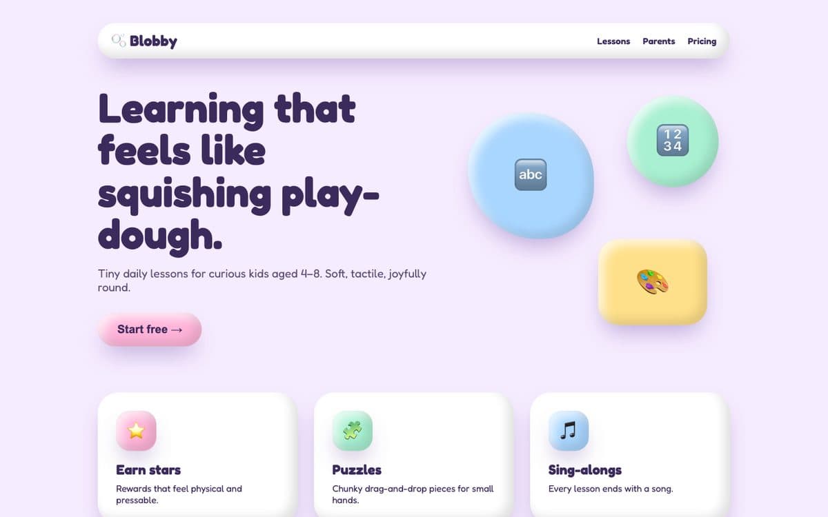 01 · Claymorphism
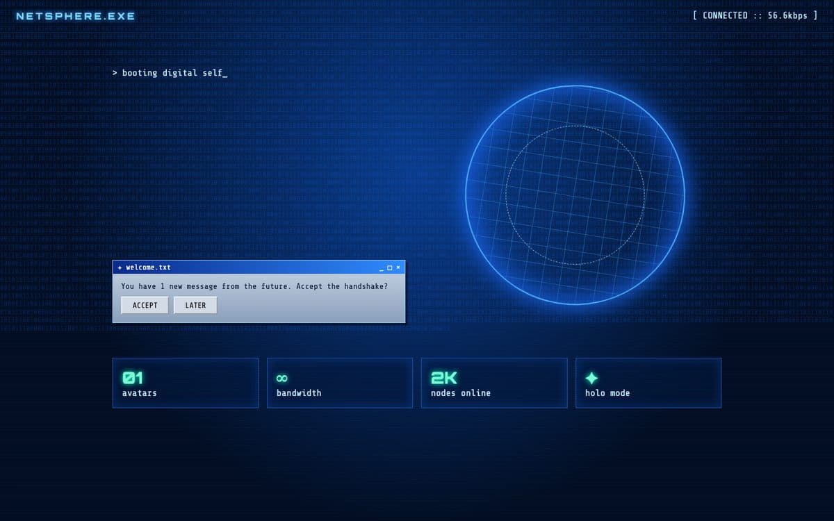 02 · Cybercore
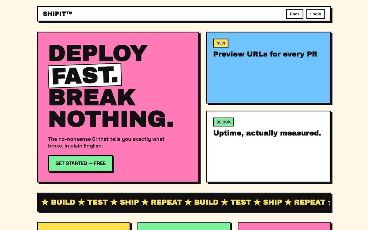 03 · Neo-Brutalism
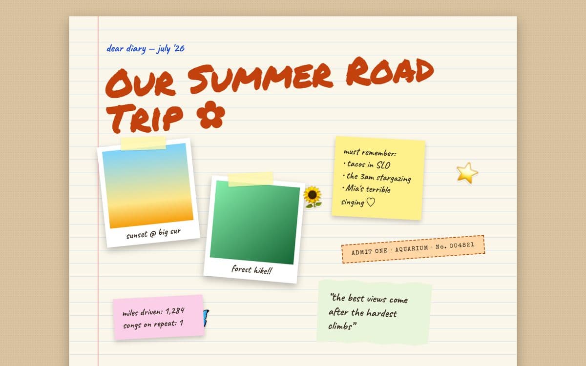 04 · Scrapbook
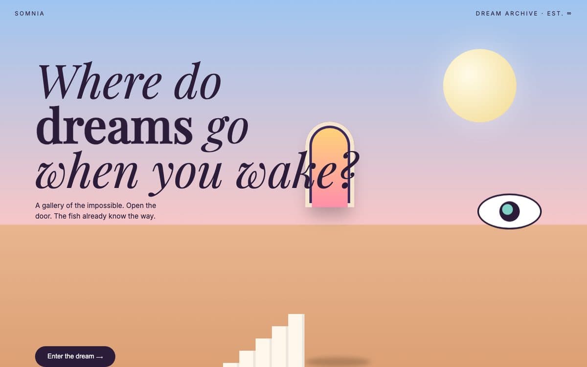 05 · Surrealism
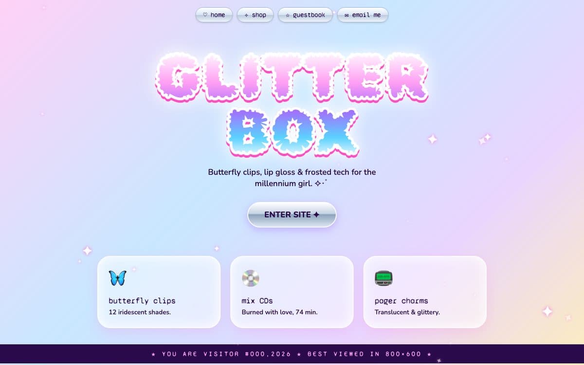 06 · Y2K Aesthetic
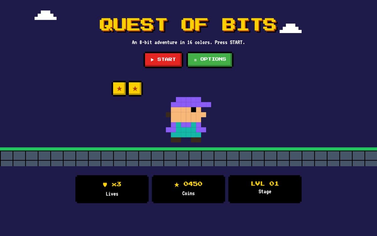 07 · Pixel Art
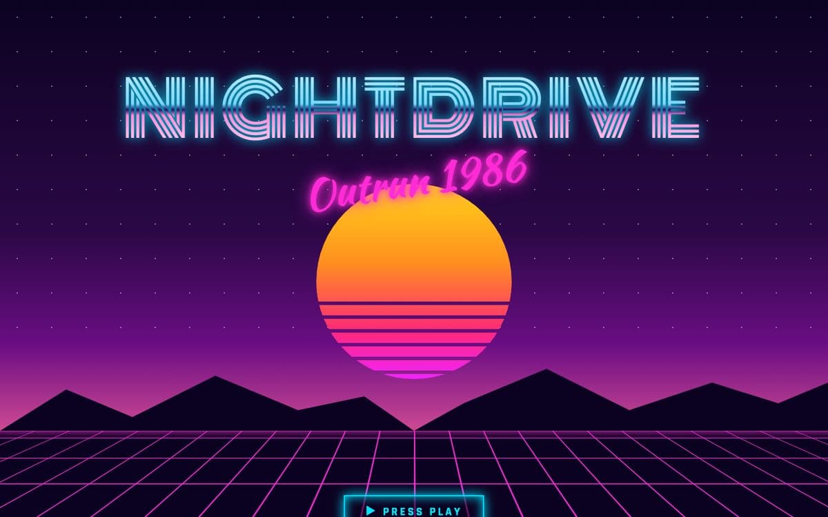 08 · Synthwave
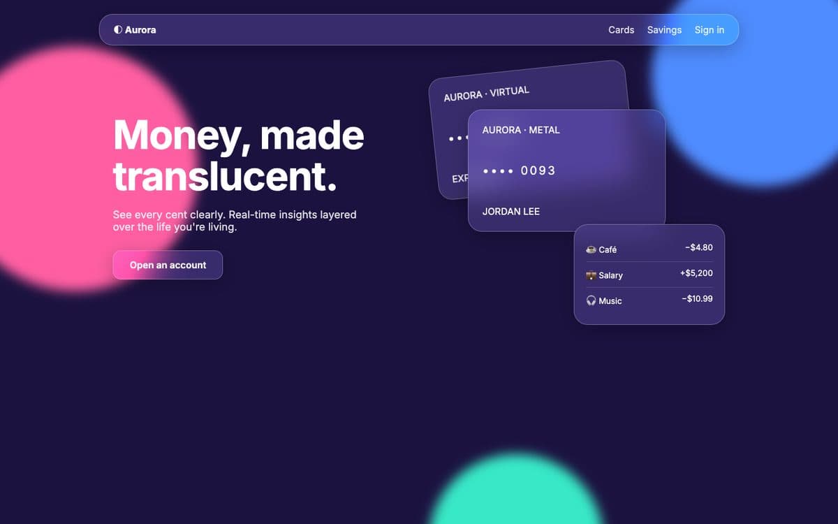 09 · Glassmorphism
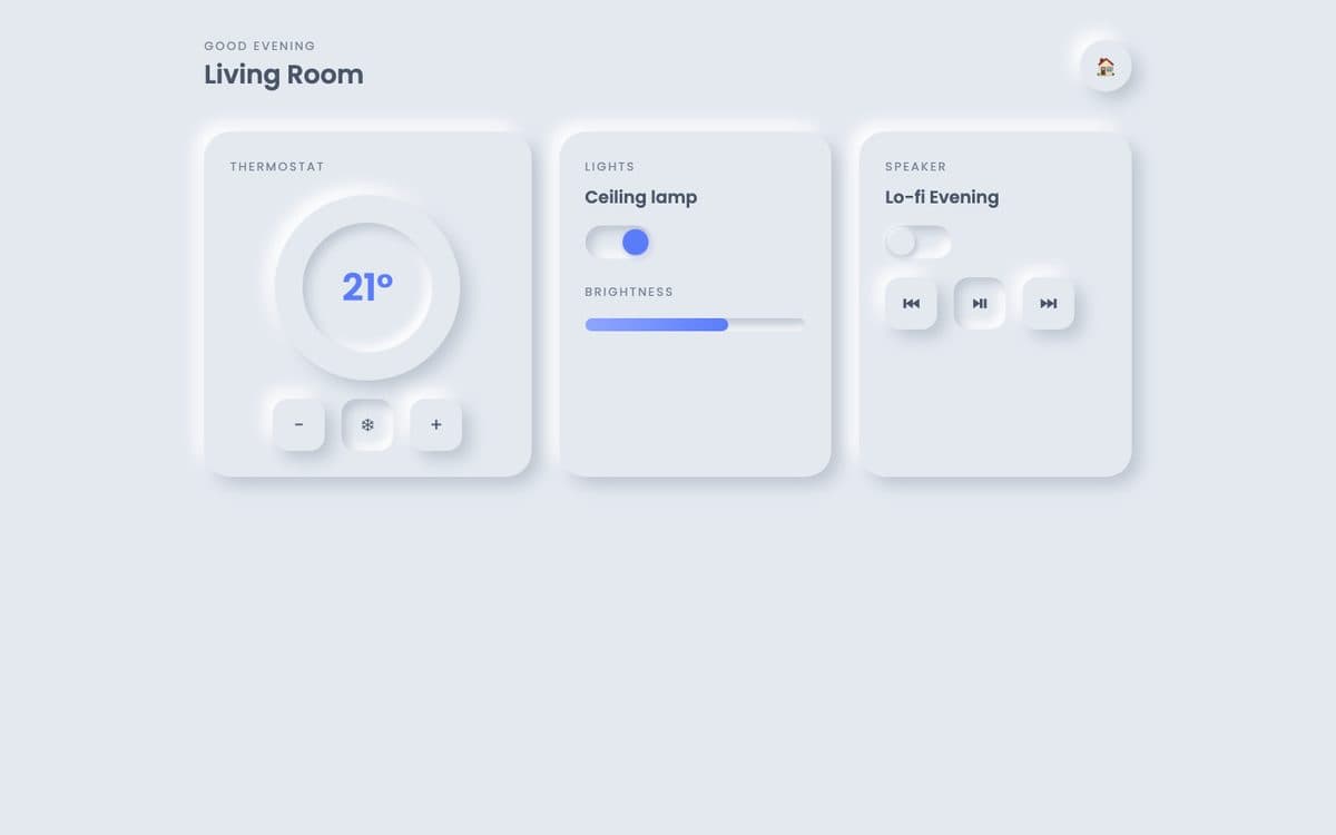 10 · Neumorphism
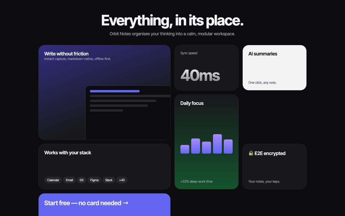 11 · Bento Grid
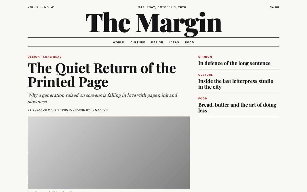 12 · Editorial Design
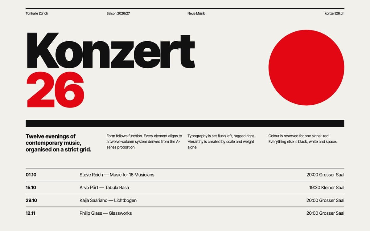 13 · Swiss Design
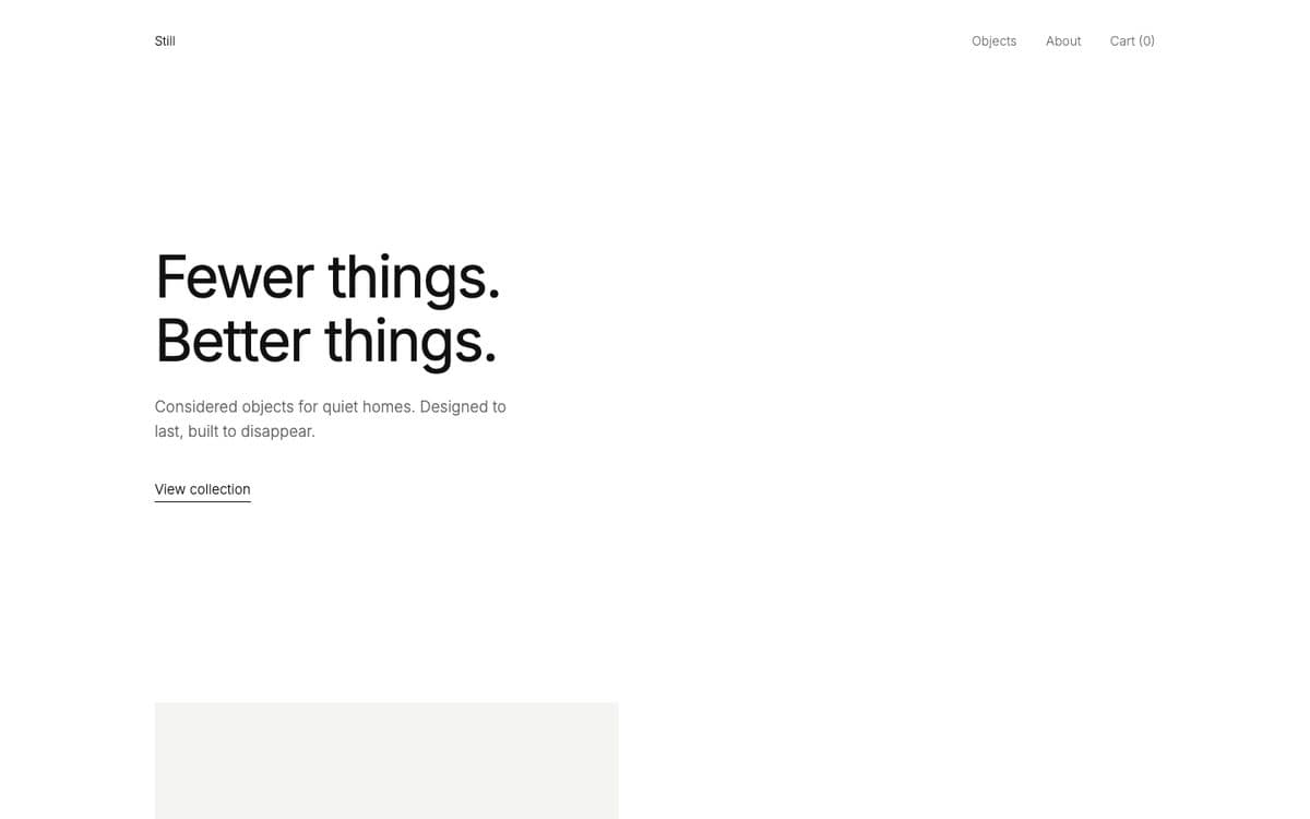 14 · Minimalism
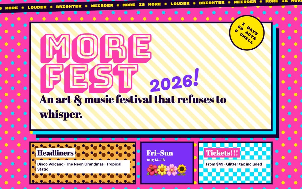 15 · Maximalism
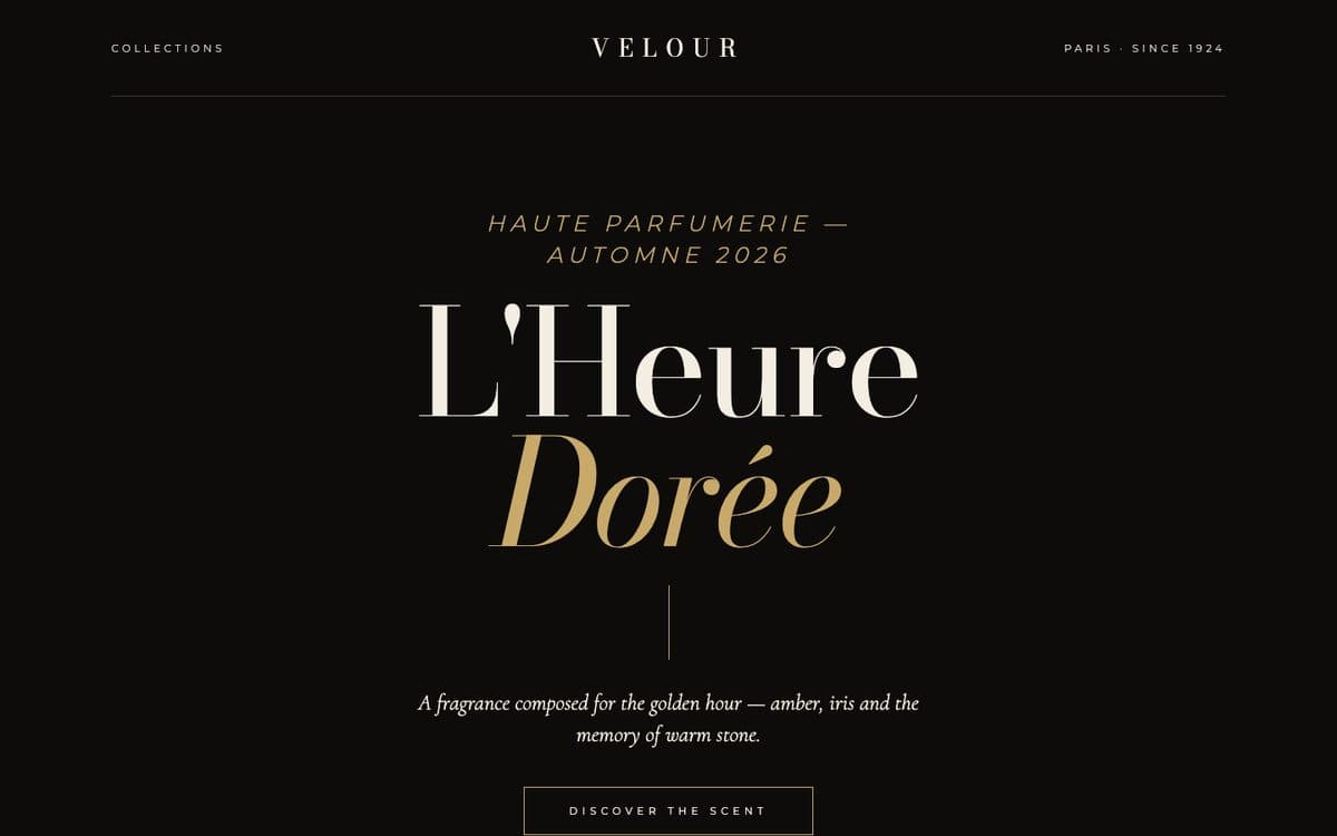 16 · Luxury Typography
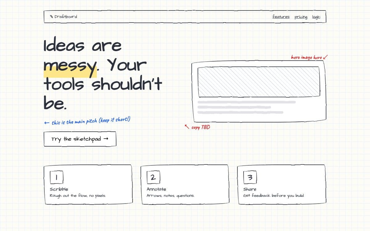 17 · Conceptual Sketch
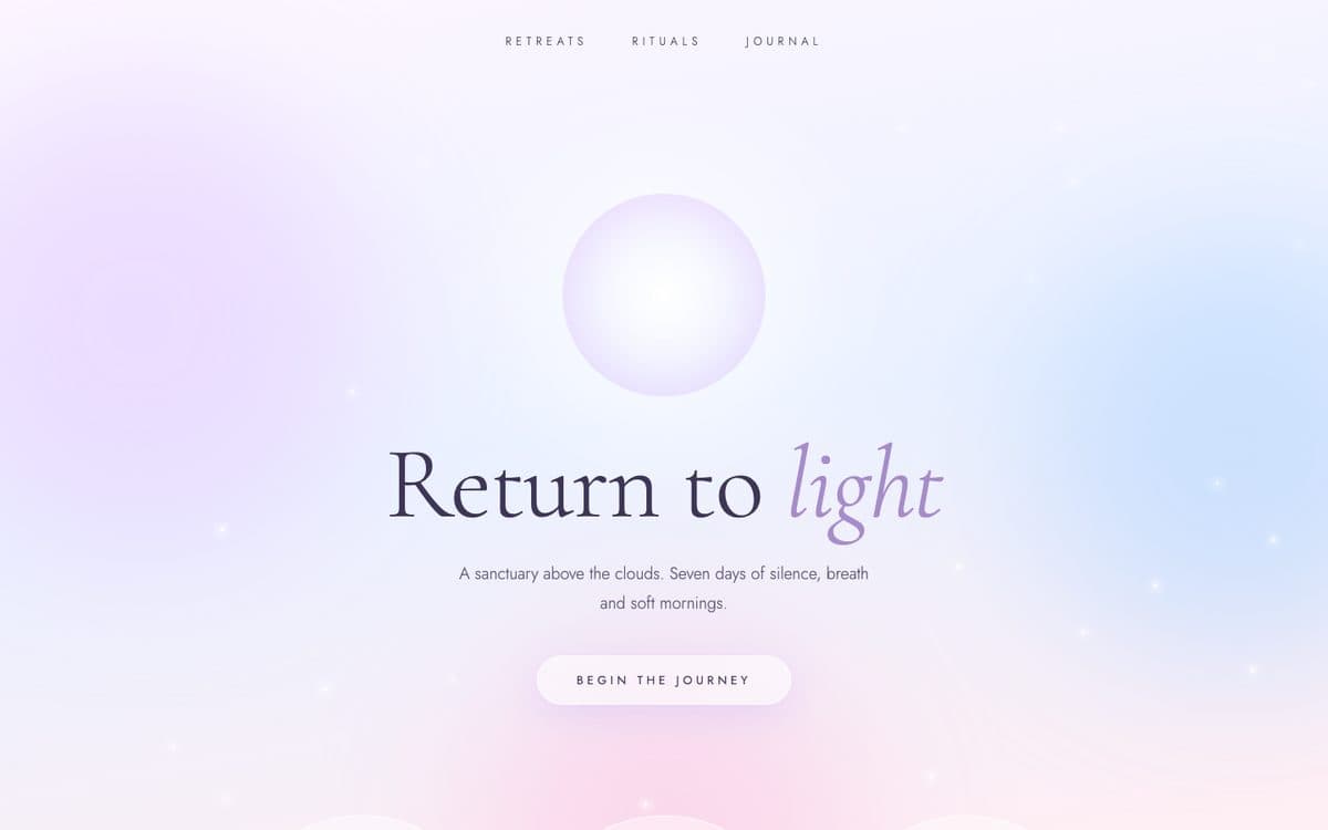 18 · Ethereal
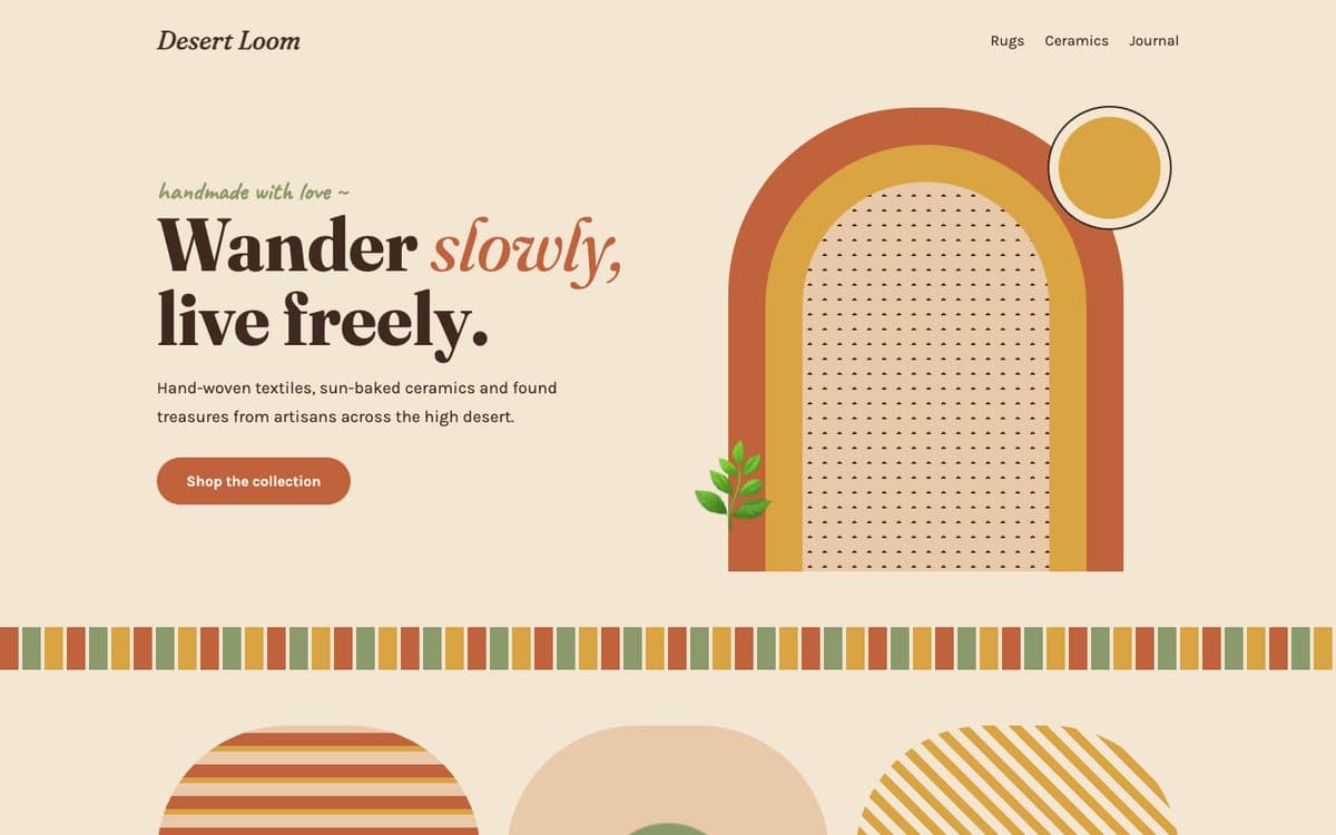 19 · Bohemian
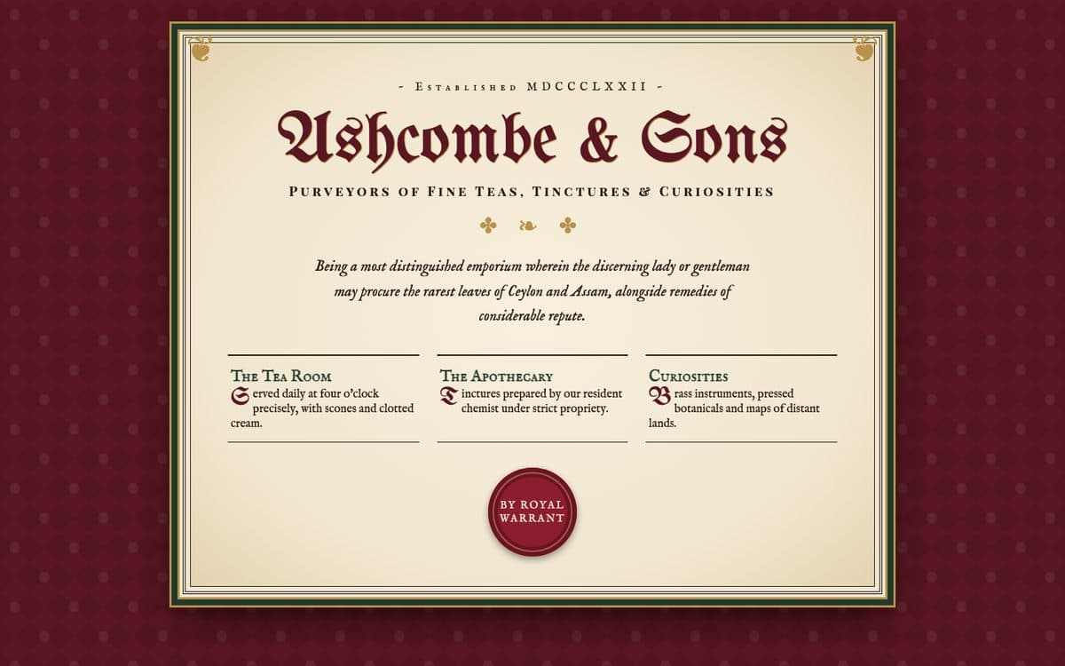 20 · Victorian
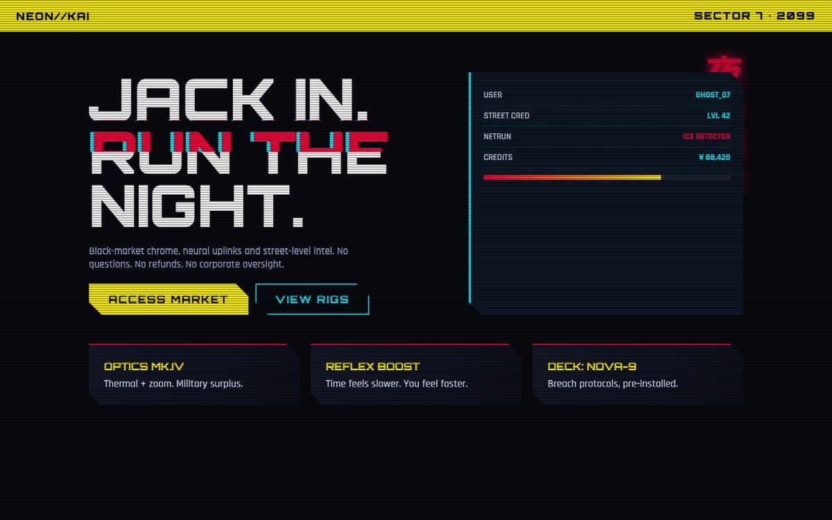 21 · Cyberpunk
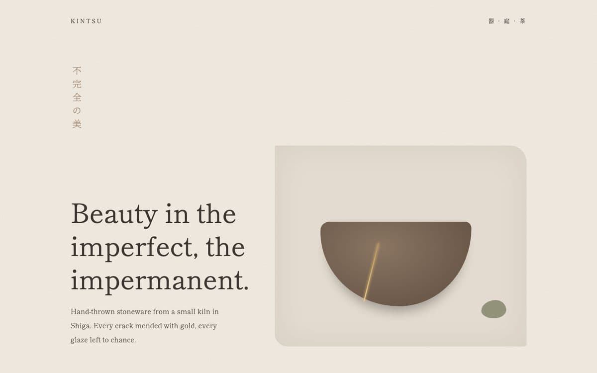 22 · Wabi-Sabi
Step one: not sure which? Let AI narrow it down
Tell the AI about your site and your audience, and it picks the 3 best fits out of the 22, plus 2 to stay away from.
I want to restyle my website and I'm choosing between these 22 design styles: Claymorphism, Cybercore, Neo-Brutalism, Scrapbook, Surrealism, Y2K Aesthetic, Pixel Art, Synthwave, Glassmorphism, Neumorphism, Bento Grid, Editorial Design, Swiss Design, Minimalism, Maximalism, Luxury Typography, Conceptual Sketch, Ethereal, Bohemian, Victorian, Cyberpunk, Wabi-Sabi.

My website: [URL or screenshot]
What I sell and to whom: [one or two sentences]
How I want visitors to feel: [e.g. calm and trusted / excited / impressed]

Recommend the 3 styles that fit my brand and audience best. For each one, tell me in two sentences why it fits, one risk to watch for, and which section of my site would change the most. Then name 2 styles from the list I should avoid, and why.
The 22 styles and their restyle prompts
1. Claymorphism
Soft, puffy, toy-like UI that looks moulded from clay.
Best for: Kids and education apps, friendly fintech, onboarding, playful consumer apps. Open the live demo ↗
You are a senior front-end designer. Restyle my website in the Claymorphism style without changing what it says or how it works.

My website: [paste the URL, upload a screenshot, or paste the code / name the files to edit]

The Claymorphism style:
- Feel: Soft, puffy, toy-like UI that looks moulded from clay.
- Colour: Pastels on a light lavender base: #f6ecff background, pink #ffb4d9, mint #a8f0d1, sky #a9d6ff, butter #ffe08a, dark plum #3b2a5c text.
- Typography: A rounded sans such as Fredoka, Nunito or Quicksand. Bold, chunky headings.
- Shapes and surfaces: Big radius (24–40px). Every card and button gets two inner shadows (light top-left, dark bottom-right) plus a soft floating drop shadow, so it looks inflated.
- Signature details: Floating 3D-looking blobs and icons, chunky pill buttons that squash slightly when pressed.
- Motion: Gentle bobbing float on decorative shapes; buttons scale to 0.96 on press.
- Avoid: Pastel text on pastel backgrounds — keep body text dark. Do not make it look childish if the brand is not.

Rules:
1. Keep every word of copy, every link, every form and the page structure. Change only the look.
2. Define the colours and fonts once (CSS variables or the Tailwind theme), then apply them section by section.
3. Text must stay readable: body text at least 4.5:1 contrast, nothing important hidden behind decoration.
4. It must still work on a phone 375px wide.
5. Before writing code, give me a 5-bullet plan for each section. Then give me the complete code or the full edited files.

If you cannot see my site, ask me for a screenshot or the code before you start.
2. Cybercore
Late-90s and 2000s internet futurism: glowing blue, wireframe globes, chrome text, OS pop-up windows.
Best for: Music artists, tech drops, game launches, fashion with a digital angle. Open the live demo ↗
You are a senior front-end designer. Restyle my website in the Cybercore style without changing what it says or how it works.

My website: [paste the URL, upload a screenshot, or paste the code / name the files to edit]

The Cybercore style:
- Feel: Late-90s and 2000s internet futurism: glowing blue, wireframe globes, chrome text, OS pop-up windows.
- Colour: Midnight #020b1f base, electric blue #2a6dff, ice #bfe9ff, aqua #7fffd4 accents, silver-chrome gradients.
- Typography: Orbitron or Michroma for display, Share Tech Mono or VT323 for body and labels.
- Shapes and surfaces: Thin glowing outlines, translucent dark panels, fake system dialogs with a gradient title bar and bevelled grey buttons.
- Signature details: Faint binary or scanline texture behind everything, a rotating wireframe sphere, chrome gradient headings with a blue glow.
- Motion: Slow sphere rotation, subtle flicker on hover, typed-out terminal text.
- Avoid: Busy textures directly behind body text. Keep paragraphs on solid dark panels.

Rules:
1. Keep every word of copy, every link, every form and the page structure. Change only the look.
2. Define the colours and fonts once (CSS variables or the Tailwind theme), then apply them section by section.
3. Text must stay readable: body text at least 4.5:1 contrast, nothing important hidden behind decoration.
4. It must still work on a phone 375px wide.
5. Before writing code, give me a 5-bullet plan for each section. Then give me the complete code or the full edited files.

If you cannot see my site, ask me for a screenshot or the code before you start.
3. Neo-Brutalism
Raw and confident: thick black outlines, hard offset shadows, loud flat colours.
Best for: SaaS and dev tools, creator products, indie brands, portfolios. Open the live demo ↗
You are a senior front-end designer. Restyle my website in the Neo-Brutalism style without changing what it says or how it works.

My website: [paste the URL, upload a screenshot, or paste the code / name the files to edit]

The Neo-Brutalism style:
- Feel: Raw and confident: thick black outlines, hard offset shadows, loud flat colours.
- Colour: Ink #111 on cream #fff8e7, with flat yellow #ffe14d, pink #ff7ab6, blue #6fc3ff and green #7cf29c blocks.
- Typography: Space Grotesk for body, Archivo Black or Lexend Mega for big uppercase headings.
- Shapes and surfaces: Everything gets a 3px solid #111 border and a hard shadow (6px 6px 0 #111, no blur). Small or zero radius.
- Signature details: Sticker-like tags, a scrolling marquee band, slightly rotated highlight words, numbered step cards in different colours.
- Motion: Buttons "press" into their shadow on hover (translate 6px, shadow to 0). No easing flourishes.
- Avoid: Making every element shout. Keep one calm area so the main call to action stands out.

Rules:
1. Keep every word of copy, every link, every form and the page structure. Change only the look.
2. Define the colours and fonts once (CSS variables or the Tailwind theme), then apply them section by section.
3. Text must stay readable: body text at least 4.5:1 contrast, nothing important hidden behind decoration.
4. It must still work on a phone 375px wide.
5. Before writing code, give me a 5-bullet plan for each section. Then give me the complete code or the full edited files.

If you cannot see my site, ask me for a screenshot or the code before you start.
4. Scrapbook
A collage of polaroids, washi tape, ticket stubs, sticky notes and handwriting.
Best for: Personal blogs, weddings and events, travel, stationery and craft brands, portfolios. Open the live demo ↗
You are a senior front-end designer. Restyle my website in the Scrapbook style without changing what it says or how it works.

My website: [paste the URL, upload a screenshot, or paste the code / name the files to edit]

The Scrapbook style:
- Feel: A collage of polaroids, washi tape, ticket stubs, sticky notes and handwriting.
- Colour: Kraft #d9c3a0 background, paper #fbf6ea, washi yellow #fff6a8, faded red #c2410c, pencil blue #1d4ed8.
- Typography: Permanent Marker for headings, Caveat for handwritten notes, Special Elite (typewriter) for body.
- Shapes and surfaces: Paper cards with real drop shadows, lined or grid paper textures, torn edges via clip-path, translucent tape strips on corners.
- Signature details: Elements rotated a few degrees and overlapping, polaroid frames for images, handwritten arrows and notes, emoji stickers.
- Motion: Cards straighten slightly on hover; minimal otherwise.
- Avoid: Absolute-positioned collages that break on mobile — stack them cleanly under 768px.

Rules:
1. Keep every word of copy, every link, every form and the page structure. Change only the look.
2. Define the colours and fonts once (CSS variables or the Tailwind theme), then apply them section by section.
3. Text must stay readable: body text at least 4.5:1 contrast, nothing important hidden behind decoration.
4. It must still work on a phone 375px wide.
5. Before writing code, give me a 5-bullet plan for each section. Then give me the complete code or the full edited files.

If you cannot see my site, ask me for a screenshot or the code before you start.
5. Surrealism
Dreamlike and impossible: floating objects, doors in the sky, giant eyes, odd scale.
Best for: Art galleries, fashion and beauty, music releases, creative agencies. Open the live demo ↗
You are a senior front-end designer. Restyle my website in the Surrealism style without changing what it says or how it works.

My website: [paste the URL, upload a screenshot, or paste the code / name the files to edit]

The Surrealism style:
- Feel: Dreamlike and impossible: floating objects, doors in the sky, giant eyes, odd scale.
- Colour: A dusk sky gradient — #9ec5f0 to rose #f7c6c7 to sand #d99a6c — with deep plum #2b1d3a text.
- Typography: Playfair Display italic (or another elegant serif) for headings, Inter for body.
- Shapes and surfaces: Few hard surfaces. Content floats over a full-bleed scene; long soft contact shadows under floating objects.
- Signature details: One deliberately "wrong" object per section (a floating door, a staircase to nowhere, an eye in the landscape), lots of empty sky.
- Motion: Slow floating loops (6–8s), drifting objects, gentle parallax on scroll.
- Avoid: Random decoration with no idea behind it. Pick one visual metaphor for the brand and repeat it.

Rules:
1. Keep every word of copy, every link, every form and the page structure. Change only the look.
2. Define the colours and fonts once (CSS variables or the Tailwind theme), then apply them section by section.
3. Text must stay readable: body text at least 4.5:1 contrast, nothing important hidden behind decoration.
4. It must still work on a phone 375px wide.
5. Before writing code, give me a 5-bullet plan for each section. Then give me the complete code or the full edited files.

If you cannot see my site, ask me for a screenshot or the code before you start.
6. Y2K Aesthetic
Turn-of-the-millennium optimism: chrome, bubble letters, iridescence, sparkles, pink and baby blue.
Best for: Gen-Z fashion and beauty, pop music, merch drops, nostalgic campaigns. Open the live demo ↗
You are a senior front-end designer. Restyle my website in the Y2K Aesthetic style without changing what it says or how it works.

My website: [paste the URL, upload a screenshot, or paste the code / name the files to edit]

The Y2K Aesthetic style:
- Feel: Turn-of-the-millennium optimism: chrome, bubble letters, iridescence, sparkles, pink and baby blue.
- Colour: Pink #ffd1f7, baby blue #c8e7ff, lilac #e9d5ff, butter #fff0b3, deep purple #2a0a4a text, silver chrome gradients.
- Typography: Rubik Bubbles or Bungee for display, Syne Mono for labels, Nunito for body.
- Shapes and surfaces: Glossy pill buttons with a multi-stop chrome gradient, translucent "bubble" cards with white borders and an inner glow.
- Signature details: Twinkling ✦ sparkles, butterflies and stars, a visitor-counter strip, iridescent gradient backgrounds.
- Motion: Twinkling sparkles, a slow shimmer across chrome on hover.
- Avoid: Using every Y2K trope at once. Choose three signature elements.

Rules:
1. Keep every word of copy, every link, every form and the page structure. Change only the look.
2. Define the colours and fonts once (CSS variables or the Tailwind theme), then apply them section by section.
3. Text must stay readable: body text at least 4.5:1 contrast, nothing important hidden behind decoration.
4. It must still work on a phone 375px wide.
5. Before writing code, give me a 5-bullet plan for each section. Then give me the complete code or the full edited files.

If you cannot see my site, ask me for a screenshot or the code before you start.
7. Pixel Art
8- and 16-bit game graphics: a hard pixel grid, limited palette, bitmap fonts.
Best for: Indie games, developer portfolios, hackathons, playful 404 pages. Open the live demo ↗
You are a senior front-end designer. Restyle my website in the Pixel Art style without changing what it says or how it works.

My website: [paste the URL, upload a screenshot, or paste the code / name the files to edit]

The Pixel Art style:
- Feel: 8- and 16-bit game graphics: a hard pixel grid, limited palette, bitmap fonts.
- Colour: A 16-colour game palette, e.g. night #1e1b4b, stone #475569, grass #22c55e, red #e52521, gold #fcd000, black #000.
- Typography: Press Start 2P for headings and buttons, VT323 or Silkscreen for body. Pixel fonts only at large sizes.
- Shapes and surfaces: Stepped "pixel" borders (box-shadow on four sides, no radius), flat fills, no gradients or blur. image-rendering: pixelated.
- Signature details: A HUD-style stats bar (lives, coins, level), a small original sprite character, pixel clouds and blocks.
- Motion: steps() animations only — sprites hop in 4 frames, buttons nudge up 3px on hover.
- Avoid: Pixel fonts at body size, and copying real game characters. Keep body text in a readable mono.

Rules:
1. Keep every word of copy, every link, every form and the page structure. Change only the look.
2. Define the colours and fonts once (CSS variables or the Tailwind theme), then apply them section by section.
3. Text must stay readable: body text at least 4.5:1 contrast, nothing important hidden behind decoration.
4. It must still work on a phone 375px wide.
5. Before writing code, give me a 5-bullet plan for each section. Then give me the complete code or the full edited files.

If you cannot see my site, ask me for a screenshot or the code before you start.
8. Synthwave
1980s retro-futurism: a neon grid horizon, striped sunset sun, chrome logo, magenta and cyan glow.
Best for: Music and playlists, gaming, nightlife and events, retro product launches. Open the live demo ↗
You are a senior front-end designer. Restyle my website in the Synthwave style without changing what it says or how it works.

My website: [paste the URL, upload a screenshot, or paste the code / name the files to edit]

The Synthwave style:
- Feel: 1980s retro-futurism: a neon grid horizon, striped sunset sun, chrome logo, magenta and cyan glow.
- Colour: Void #0b0221, purple #2a0845, magenta #ff2bd6, hot pink #ff2975, sun yellow #ffd319, cyan #00e5ff.
- Typography: Monoton or Audiowide for the logo, a brush script (Kaushan Script) for accents, Rajdhani for body.
- Shapes and surfaces: Dark sections with neon outlines and outer glow; outline buttons glowing cyan.
- Signature details: Hero with a perspective neon grid floor, a half-sun with horizontal stripes, mountain silhouettes, chrome gradient title.
- Motion: The grid scrolls toward the viewer in a loop; neon flickers once on load.
- Avoid: Neon glow on body text. Glow the headings and buttons; keep paragraphs plain white on dark.

Rules:
1. Keep every word of copy, every link, every form and the page structure. Change only the look.
2. Define the colours and fonts once (CSS variables or the Tailwind theme), then apply them section by section.
3. Text must stay readable: body text at least 4.5:1 contrast, nothing important hidden behind decoration.
4. It must still work on a phone 375px wide.
5. Before writing code, give me a 5-bullet plan for each section. Then give me the complete code or the full edited files.

If you cannot see my site, ask me for a screenshot or the code before you start.
9. Glassmorphism
Frosted-glass panels floating over colourful blurred shapes.
Best for: Fintech, dashboards, music players, weather, crypto, OS-like interfaces. Open the live demo ↗
You are a senior front-end designer. Restyle my website in the Glassmorphism style without changing what it says or how it works.

My website: [paste the URL, upload a screenshot, or paste the code / name the files to edit]

The Glassmorphism style:
- Feel: Frosted-glass panels floating over colourful blurred shapes.
- Colour: Deep base #1b1240 with vivid blurred orbs (pink #ff5fa2, blue #4f8cff, teal #38e8c6); glass is white at 10–30% opacity.
- Typography: Inter, Manrope or Plus Jakarta Sans. Clean, medium weights.
- Shapes and surfaces: background: rgba(255,255,255,.12); backdrop-filter: blur(20px) saturate(160%); a 1px rgba(255,255,255,.28) border; radius 20–24px.
- Signature details: Layered, slightly overlapping cards; large soft colour blobs behind the hero; a frosted sticky nav.
- Motion: Blobs drift slowly; cards lift 2–4px on hover.
- Avoid: Text contrast that depends on what is behind the glass. Test every text block over the busiest part of the background.

Rules:
1. Keep every word of copy, every link, every form and the page structure. Change only the look.
2. Define the colours and fonts once (CSS variables or the Tailwind theme), then apply them section by section.
3. Text must stay readable: body text at least 4.5:1 contrast, nothing important hidden behind decoration.
4. It must still work on a phone 375px wide.
5. Before writing code, give me a 5-bullet plan for each section. Then give me the complete code or the full edited files.

If you cannot see my site, ask me for a screenshot or the code before you start.
10. Neumorphism
Soft UI extruded from, or pressed into, a single-colour surface.
Best for: Smart-home controls, music players, calculators, small widgets — used as an accent, not a whole site. Open the live demo ↗
You are a senior front-end designer. Restyle my website in the Neumorphism style without changing what it says or how it works.

My website: [paste the URL, upload a screenshot, or paste the code / name the files to edit]

The Neumorphism style:
- Feel: Soft UI extruded from, or pressed into, a single-colour surface.
- Colour: Surface #e4e9f0, shadow #bec5d0, highlight #ffffff, one accent #5b7cfa, text #4a5568.
- Typography: Poppins or Nunito Sans, medium weight.
- Shapes and surfaces: Background and elements share the same colour. Raised: 9px 9px 18px #bec5d0, -9px -9px 18px #fff. Pressed: the same as inset shadows. Radius 16–28px.
- Signature details: Dials, toggles and sliders; the active state shown by switching raised to pressed.
- Motion: Short 150ms transitions between raised and pressed.
- Avoid: Low-contrast buttons that disappear into the background. Give every interactive element a coloured label, icon or outline too.

Rules:
1. Keep every word of copy, every link, every form and the page structure. Change only the look.
2. Define the colours and fonts once (CSS variables or the Tailwind theme), then apply them section by section.
3. Text must stay readable: body text at least 4.5:1 contrast, nothing important hidden behind decoration.
4. It must still work on a phone 375px wide.
5. Before writing code, give me a 5-bullet plan for each section. Then give me the complete code or the full edited files.

If you cannot see my site, ask me for a screenshot or the code before you start.
11. Bento Grid
Content laid out as a grid of rounded tiles in different sizes, like a bento box.
Best for: Feature overviews, product pages, portfolios, link-in-bio pages. Open the live demo ↗
You are a senior front-end designer. Restyle my website in the Bento Grid style without changing what it says or how it works.

My website: [paste the URL, upload a screenshot, or paste the code / name the files to edit]

The Bento Grid style:
- Feel: Content laid out as a grid of rounded tiles in different sizes, like a bento box.
- Colour: Dark #0c0c0e with zinc tiles #18181b and borders #27272a, plus one brand accent (e.g. #6366f1). A light version uses #f5f5f7.
- Typography: Inter Tight, Geist or Satoshi; tight letter-spacing on headings.
- Shapes and surfaces: CSS grid (4 columns, ~190px rows); tiles span 1–2 columns and rows; radius 20–28px; one idea per tile.
- Signature details: Mix tile types: one big hero tile, a big-number stat, a mini chart, a product mockup, a logo cloud, a CTA tile in the accent colour.
- Motion: Tiles fade up in sequence on scroll; subtle hover lift.
- Avoid: Every tile looking the same. Vary the content type, and collapse to 2 then 1 column on smaller screens.

Rules:
1. Keep every word of copy, every link, every form and the page structure. Change only the look.
2. Define the colours and fonts once (CSS variables or the Tailwind theme), then apply them section by section.
3. Text must stay readable: body text at least 4.5:1 contrast, nothing important hidden behind decoration.
4. It must still work on a phone 375px wide.
5. Before writing code, give me a 5-bullet plan for each section. Then give me the complete code or the full edited files.

If you cannot see my site, ask me for a screenshot or the code before you start.
12. Editorial Design
Magazine and newspaper layout on the web: mastheads, columns, drop caps, pull quotes.
Best for: Publications, blogs, long-form storytelling, brand journals. Open the live demo ↗
You are a senior front-end designer. Restyle my website in the Editorial Design style without changing what it says or how it works.

My website: [paste the URL, upload a screenshot, or paste the code / name the files to edit]

The Editorial Design style:
- Feel: Magazine and newspaper layout on the web: mastheads, columns, drop caps, pull quotes.
- Colour: Newsprint #faf8f3, ink #161616, one accent red #b91c1c for kickers.
- Typography: Playfair Display (900 weight) for headlines, Source Serif or Newsreader for body, small uppercase Inter for labels and bylines.
- Shapes and surfaces: No cards. Structure comes from rules: a double-rule masthead, thin column rules, hairlines between stories.
- Signature details: Kicker → headline → italic standfirst → byline; a ::first-letter drop cap; a full-width italic pull quote; captions under images.
- Motion: Almost none. Let typography do the work.
- Avoid: Multi-column body text on phones — use columns only on wide screens and for short passages.

Rules:
1. Keep every word of copy, every link, every form and the page structure. Change only the look.
2. Define the colours and fonts once (CSS variables or the Tailwind theme), then apply them section by section.
3. Text must stay readable: body text at least 4.5:1 contrast, nothing important hidden behind decoration.
4. It must still work on a phone 375px wide.
5. Before writing code, give me a 5-bullet plan for each section. Then give me the complete code or the full edited files.

If you cannot see my site, ask me for a screenshot or the code before you start.
13. Swiss Design
The 1950s International Typographic Style: a strict grid, big grotesk type, one signal colour.
Best for: Architecture, cultural institutions, design studios, event programmes, corporate identity. Open the live demo ↗
You are a senior front-end designer. Restyle my website in the Swiss Design style without changing what it says or how it works.

My website: [paste the URL, upload a screenshot, or paste the code / name the files to edit]

The Swiss Design style:
- Feel: The 1950s International Typographic Style: a strict grid, big grotesk type, one signal colour.
- Colour: Off-white #f2f0eb, black #111, and Swiss red #e30613 as the only colour.
- Typography: Inter Tight, Helvetica or Neue Haas Grotesk. Display at 900 weight, letter-spacing -0.05em, line-height 0.85. Flush left, ragged right.
- Shapes and surfaces: No shadows, no radius. A visible 12-column grid; everything aligns to it.
- Signature details: Huge headline, a flat red circle or bar as the only graphic, a thin top rule with metadata in four columns, tabular lists with hairlines.
- Motion: Minimal — rows invert to red on hover.
- Avoid: Decoration. Create interest only with scale, weight and space.

Rules:
1. Keep every word of copy, every link, every form and the page structure. Change only the look.
2. Define the colours and fonts once (CSS variables or the Tailwind theme), then apply them section by section.
3. Text must stay readable: body text at least 4.5:1 contrast, nothing important hidden behind decoration.
4. It must still work on a phone 375px wide.
5. Before writing code, give me a 5-bullet plan for each section. Then give me the complete code or the full edited files.

If you cannot see my site, ask me for a screenshot or the code before you start.
14. Minimalism
"Less, but better": only the essential content, with whitespace doing the work.
Best for: Premium e-commerce, studios, portfolios, product launches. Open the live demo ↗
You are a senior front-end designer. Restyle my website in the Minimalism style without changing what it says or how it works.

My website: [paste the URL, upload a screenshot, or paste the code / name the files to edit]

The Minimalism style:
- Feel: "Less, but better": only the essential content, with whitespace doing the work.
- Colour: White #ffffff, black #111, greys #666 and #f4f4f2. No accent colour, or one used once.
- Typography: One typeface (Inter or Neue Montreal), two weights at most, light 300 for body.
- Shapes and surfaces: No borders or shadows. Very large vertical spacing (15–25vh between sections).
- Signature details: One message per screen, one call to action as an underlined text link, product photography on soft grey.
- Motion: Slow fades only.
- Avoid: Hiding things users need (navigation, prices, the buy button) in the name of minimalism.

Rules:
1. Keep every word of copy, every link, every form and the page structure. Change only the look.
2. Define the colours and fonts once (CSS variables or the Tailwind theme), then apply them section by section.
3. Text must stay readable: body text at least 4.5:1 contrast, nothing important hidden behind decoration.
4. It must still work on a phone 375px wide.
5. Before writing code, give me a 5-bullet plan for each section. Then give me the complete code or the full edited files.

If you cannot see my site, ask me for a screenshot or the code before you start.
15. Maximalism
"More is more": clashing patterns, several typefaces, saturated colour and dense collage.
Best for: Festivals, fashion drops, food and drink brands, youth campaigns, creative agencies. Open the live demo ↗
You are a senior front-end designer. Restyle my website in the Maximalism style without changing what it says or how it works.

My website: [paste the URL, upload a screenshot, or paste the code / name the files to edit]

The Maximalism style:
- Feel: "More is more": clashing patterns, several typefaces, saturated colour and dense collage.
- Colour: Hot pink #ff3cac, yellow #ffe600, cyan #00e0ff, purple #7b2ff7, deep #1a0033.
- Typography: Mix four: Bungee Shade (display), Abril Fatface (subheads), Rubik Mono One (labels), Pacifico (accents), DM Sans (body).
- Shapes and surfaces: Thick borders with stacked offset shadows in two colours; pattern fills — polka dots, leopard, checkerboard, stripes.
- Signature details: A rotating badge, a marquee ticker, oversized type that overlaps images, stickers and emoji, no empty areas.
- Motion: Marquees, spinning badges, bouncy hover states.
- Avoid: Losing the hierarchy. Under the chaos there must be one clear headline and one clear call to action.

Rules:
1. Keep every word of copy, every link, every form and the page structure. Change only the look.
2. Define the colours and fonts once (CSS variables or the Tailwind theme), then apply them section by section.
3. Text must stay readable: body text at least 4.5:1 contrast, nothing important hidden behind decoration.
4. It must still work on a phone 375px wide.
5. Before writing code, give me a 5-bullet plan for each section. Then give me the complete code or the full edited files.

If you cannot see my site, ask me for a screenshot or the code before you start.
16. Luxury Typography
Type-led luxury: high-contrast serifs, wide-tracked capitals, gold hairlines, lots of air.
Best for: Fragrance, jewellery, fashion, hotels, wine and spirits, high-end real estate. Open the live demo ↗
You are a senior front-end designer. Restyle my website in the Luxury Typography style without changing what it says or how it works.

My website: [paste the URL, upload a screenshot, or paste the code / name the files to edit]

The Luxury Typography style:
- Feel: Type-led luxury: high-contrast serifs, wide-tracked capitals, gold hairlines, lots of air.
- Colour: Black #0d0c0a, cream #f3ede2, antique gold #c8a96a.
- Typography: Bodoni Moda or Cormorant Garamond for display (huge, with italic accents in gold); Montserrat Light uppercase with 4–10px letter-spacing for labels.
- Shapes and surfaces: No cards. 1px gold rules and vertical hairlines; outline buttons that fill gold on hover.
- Signature details: Centred, symmetrical layouts; a small tracked eyebrow above each headline; Roman numerals for sections.
- Motion: Slow (600–900ms) fades and letter-spacing reveals.
- Avoid: Hairlines and tracked text so thin they vanish on ordinary screens. Labels at least 11px.

Rules:
1. Keep every word of copy, every link, every form and the page structure. Change only the look.
2. Define the colours and fonts once (CSS variables or the Tailwind theme), then apply them section by section.
3. Text must stay readable: body text at least 4.5:1 contrast, nothing important hidden behind decoration.
4. It must still work on a phone 375px wide.
5. Before writing code, give me a 5-bullet plan for each section. Then give me the complete code or the full edited files.

If you cannot see my site, ask me for a screenshot or the code before you start.
17. Conceptual Sketch
A hand-drawn, work-in-progress look: pencil wireframes, graph paper, arrows and margin notes.
Best for: Whiteboard and design tools, agency process pages, education, early-stage startups, docs. Open the live demo ↗
You are a senior front-end designer. Restyle my website in the Conceptual Sketch style without changing what it says or how it works.

My website: [paste the URL, upload a screenshot, or paste the code / name the files to edit]

The Conceptual Sketch style:
- Feel: A hand-drawn, work-in-progress look: pencil wireframes, graph paper, arrows and margin notes.
- Colour: Paper #fdfcf7, graphite #2b2f3a, blueprint grid #e6eef8, highlighter #fde68a, red pen #dc2626, blue pen #2563eb.
- Typography: Architects Daughter or Kalam for headings and UI, Caveat for annotations.
- Shapes and surfaces: Wobbly borders (border-radius: 255px 15px 225px 15px / 15px 225px 15px 255px) plus an SVG feTurbulence displacement filter; hatched image placeholders.
- Signature details: Highlighter marks behind key words, handwritten arrows pointing at features, numbered steps in hand-drawn circles.
- Motion: Lines draw themselves in on scroll (stroke-dashoffset).
- Avoid: Looking unfinished. Spacing and hierarchy underneath must be crisp.

Rules:
1. Keep every word of copy, every link, every form and the page structure. Change only the look.
2. Define the colours and fonts once (CSS variables or the Tailwind theme), then apply them section by section.
3. Text must stay readable: body text at least 4.5:1 contrast, nothing important hidden behind decoration.
4. It must still work on a phone 375px wide.
5. Before writing code, give me a 5-bullet plan for each section. Then give me the complete code or the full edited files.

If you cannot see my site, ask me for a screenshot or the code before you start.
18. Ethereal
Airy softness: pastel light, glows, haze, floating particles and delicate serifs.
Best for: Wellness and spa, meditation apps, bridal, skincare, retreats. Open the live demo ↗
You are a senior front-end designer. Restyle my website in the Ethereal style without changing what it says or how it works.

My website: [paste the URL, upload a screenshot, or paste the code / name the files to edit]

The Ethereal style:
- Feel: Airy softness: pastel light, glows, haze, floating particles and delicate serifs.
- Colour: Lavender #e9d5ff, powder blue #bfdbfe, blush #fbcfe8, cream #fffaf0, soft plum text #4b4462.
- Typography: Cormorant Garamond light and italic for headings, Jost Light for body, wide-tracked small caps for nav.
- Shapes and surfaces: Translucent white panels with arched tops (border-radius: 200px 200px 24px 24px); large blurred colour fields (blur 80px) behind everything.
- Signature details: A soft white halo in the hero, slowly rising light particles, generous breathing room.
- Motion: Slow drifting glows (15–20s loops); respect prefers-reduced-motion.
- Avoid: Washed-out text. Body copy still needs 4.5:1 contrast.

Rules:
1. Keep every word of copy, every link, every form and the page structure. Change only the look.
2. Define the colours and fonts once (CSS variables or the Tailwind theme), then apply them section by section.
3. Text must stay readable: body text at least 4.5:1 contrast, nothing important hidden behind decoration.
4. It must still work on a phone 375px wide.
5. Before writing code, give me a 5-bullet plan for each section. Then give me the complete code or the full edited files.

If you cannot see my site, ask me for a screenshot or the code before you start.
19. Bohemian
Earthy and free-spirited: arches, sunbursts, woven patterns, plants and warm natural colour.
Best for: Home décor, handmade shops, yoga and wellness, cafés, travel, weddings. Open the live demo ↗
You are a senior front-end designer. Restyle my website in the Bohemian style without changing what it says or how it works.

My website: [paste the URL, upload a screenshot, or paste the code / name the files to edit]

The Bohemian style:
- Feel: Earthy and free-spirited: arches, sunbursts, woven patterns, plants and warm natural colour.
- Colour: Terracotta #c0623b, mustard #d9a441, sage #8a9a6b, sand #f3e6d3, clay #e8c9a9, cocoa #3e2a1f.
- Typography: Fraunces (soft serif with italics) for headings, Karla for body, Caveat for small handwritten accents.
- Shapes and surfaces: Arch-topped image frames (border-radius: 200px 200px 0 0), layered rainbow arcs, woven stripe bands between sections.
- Signature details: A sun motif, a handwritten tagline above the headline, pill-shaped terracotta buttons, real product photography.
- Motion: Gentle fade-ins; the sun can rotate very slowly.
- Avoid: Decoration replacing real photography — for boho, the products and people carry the mood.

Rules:
1. Keep every word of copy, every link, every form and the page structure. Change only the look.
2. Define the colours and fonts once (CSS variables or the Tailwind theme), then apply them section by section.
3. Text must stay readable: body text at least 4.5:1 contrast, nothing important hidden behind decoration.
4. It must still work on a phone 375px wide.
5. Before writing code, give me a 5-bullet plan for each section. Then give me the complete code or the full edited files.

If you cannot see my site, ask me for a screenshot or the code before you start.
20. Victorian
Ornate 19th-century styling: engraved frames, damask, blackletter, wax seals and jewel tones.
Best for: Tea, whisky and spirits, barbers, bookshops, heritage brands, theatre, fantasy games. Open the live demo ↗
You are a senior front-end designer. Restyle my website in the Victorian style without changing what it says or how it works.

My website: [paste the URL, upload a screenshot, or paste the code / name the files to edit]

The Victorian style:
- Feel: Ornate 19th-century styling: engraved frames, damask, blackletter, wax seals and jewel tones.
- Colour: Burgundy #5a1622, forest #1f3a2d, antique gold #b8924a, parchment #f1e6cf, ink brown #2a1a12.
- Typography: UnifrakturMaguntia (blackletter) for the logo only, IM Fell English and IM Fell English SC for headings, Playfair Display SC for labels.
- Shapes and surfaces: Double and triple frames (border + outline with outline-offset + stacked box-shadow rings), a parchment panel with a vignette, a damask-patterned page background.
- Signature details: Corner ornaments ❦ ✤ ❧, centred symmetrical layout, illuminated first letters, a wax-seal badge, "Est. MDCCCLXXII"-style lines.
- Motion: None needed; at most a slow fade.
- Avoid: Blackletter for anything people must read, and ornament so dense it crowds out content on mobile.

Rules:
1. Keep every word of copy, every link, every form and the page structure. Change only the look.
2. Define the colours and fonts once (CSS variables or the Tailwind theme), then apply them section by section.
3. Text must stay readable: body text at least 4.5:1 contrast, nothing important hidden behind decoration.
4. It must still work on a phone 375px wide.
5. Before writing code, give me a 5-bullet plan for each section. Then give me the complete code or the full edited files.

If you cannot see my site, ask me for a screenshot or the code before you start.
21. Cyberpunk
"High tech, low life": neon on near-black, angular HUD panels, glitch text, vertical kanji.
Best for: Games, esports, tech hardware, streetwear, nightlife and music. Open the live demo ↗
You are a senior front-end designer. Restyle my website in the Cyberpunk style without changing what it says or how it works.

My website: [paste the URL, upload a screenshot, or paste the code / name the files to edit]

The Cyberpunk style:
- Feel: "High tech, low life": neon on near-black, angular HUD panels, glitch text, vertical kanji.
- Colour: Near-black #0a0a12, warning yellow #fcee0a, cyan #00f0ff, red-magenta #ff003c.
- Typography: Orbitron or Chakra Petch for headings, Rajdhani for body, Noto Sans JP for kanji accents.
- Shapes and surfaces: Chamfered corners via clip-path, HUD panels with a cyan left border, a scanline overlay across the page.
- Signature details: An RGB-split glitch headline (::before/::after with offset clip-path), stat rows with meters, yellow solid buttons, vertical Japanese text.
- Motion: Short glitch bursts on the headline, flicker on hover — disabled under prefers-reduced-motion.
- Avoid: Constant flashing (a seizure risk) and overloading every panel with effects.

Rules:
1. Keep every word of copy, every link, every form and the page structure. Change only the look.
2. Define the colours and fonts once (CSS variables or the Tailwind theme), then apply them section by section.
3. Text must stay readable: body text at least 4.5:1 contrast, nothing important hidden behind decoration.
4. It must still work on a phone 375px wide.
5. Before writing code, give me a 5-bullet plan for each section. Then give me the complete code or the full edited files.

If you cannot see my site, ask me for a screenshot or the code before you start.
22. Wabi-Sabi
The Japanese beauty of imperfection: quiet, natural, textured and asymmetric.
Best for: Ceramics and craft, tea, interiors, architecture, slow-living brands, restaurants. Open the live demo ↗
You are a senior front-end designer. Restyle my website in the Wabi-Sabi style without changing what it says or how it works.

My website: [paste the URL, upload a screenshot, or paste the code / name the files to edit]

The Wabi-Sabi style:
- Feel: The Japanese beauty of imperfection: quiet, natural, textured and asymmetric.
- Colour: Washi #efe9df, charcoal #3d3630, clay #a8907a, moss #7d8064, ash #c9bfb1, kintsugi gold #b89254 (used sparingly).
- Typography: Shippori Mincho or Noto Serif JP for headings and body; small, wide-spaced labels.
- Shapes and surfaces: A subtle paper-grain noise texture (SVG feTurbulence) on the background, irregular organic radii on images, thin ash-coloured rules.
- Signature details: Off-grid asymmetry (staggered columns), vertical Japanese text as an accent, a single gold "kintsugi" line, generous negative space.
- Motion: Very slow fades; nothing bouncy.
- Avoid: Imperfection that looks careless. The alignment logic must still be visible.

Rules:
1. Keep every word of copy, every link, every form and the page structure. Change only the look.
2. Define the colours and fonts once (CSS variables or the Tailwind theme), then apply them section by section.
3. Text must stay readable: body text at least 4.5:1 contrast, nothing important hidden behind decoration.
4. It must still work on a phone 375px wide.
5. Before writing code, give me a 5-bullet plan for each section. Then give me the complete code or the full edited files.

If you cannot see my site, ask me for a screenshot or the code before you start.
Start with the hero: Don’t ask for the whole site in one go the first time. Have it restyle only the hero, check the style is right, then ask it to "carry the same colours and fonts through the remaining sections". If it misses, you have only lost one section.
